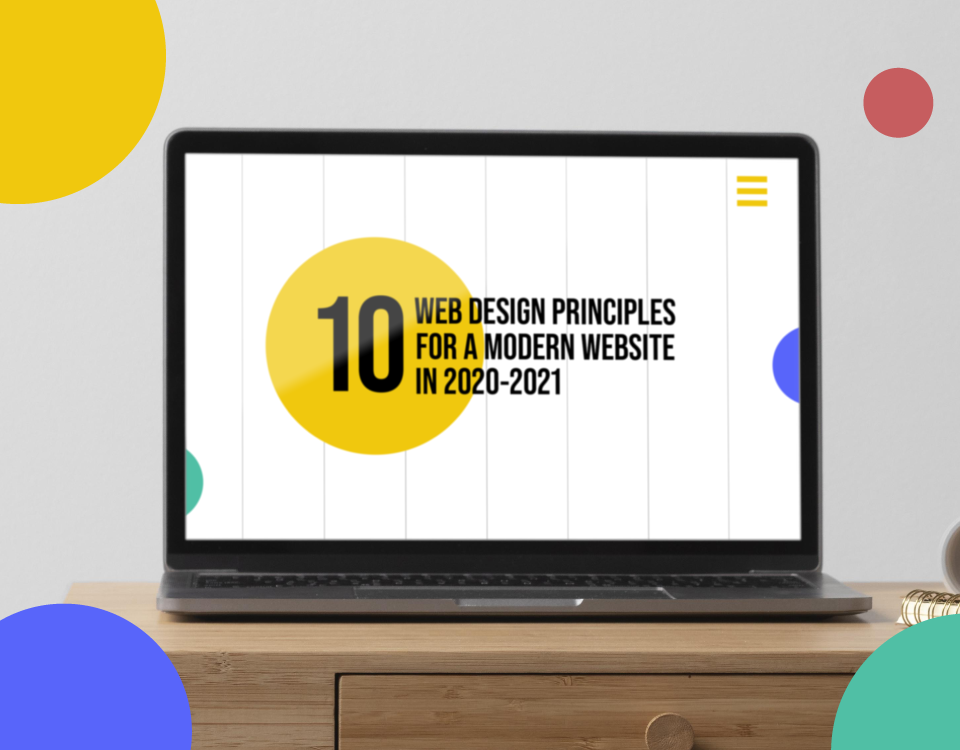
10 Web Design Principles for a Modern Website in 2020-2021
Stay relevant with these best practices for modern design.
Whether we like it or not, 2021 is rapidly approaching! That means it’s time to start thinking about the web design trends and best practices that will keep your brand and business looking fresh and modern in the new year.
While some of these principles are tried-and-true best practices that should be applied to any site, others are trends we’ve seen making their way onto some of our favorite websites on the internet. Apply these principles to your business’ site, and you can be sure to turn user’s heads in 2021.
1. Consider Your Audience

Always ground your design work in one simple principle– your audience is everything.
You should always start your process by thinking about who your client is, what information they need, and why. Design from the perspective of your user, not your company!
2. Build from the perspective of your ideal client

You might understand who your audience is, but in some cases this could encompass millions of people. Instead of trying to make a generic, one-size-fits-all website, consider who you want to serve. What information does your perfect client need to see? What style of communication will engage them? Answering these questions will help you create content that hooks your dream client.
3. Use clear and well-planned calls to action
Nothing scares users away more than a website that is confusing and doesn’t send a clear message. Mapping out user journeys is an excellent way to determine where calls to action should be located and how they should be written.
Again, think about what your users want, and then give them a clear plan of action to get there. The experience should be well thought out on your end, and seamless from the perspective of the user.
4. Make navigation streamlined and intuitive
A user should be able to understand where information is housed on your site almost immediately.
Card sorting exercises and data analytics can help you determine where users expect to find information. Use these methods to design your sitemap and menu, and you can be sure that user expectations will be met.
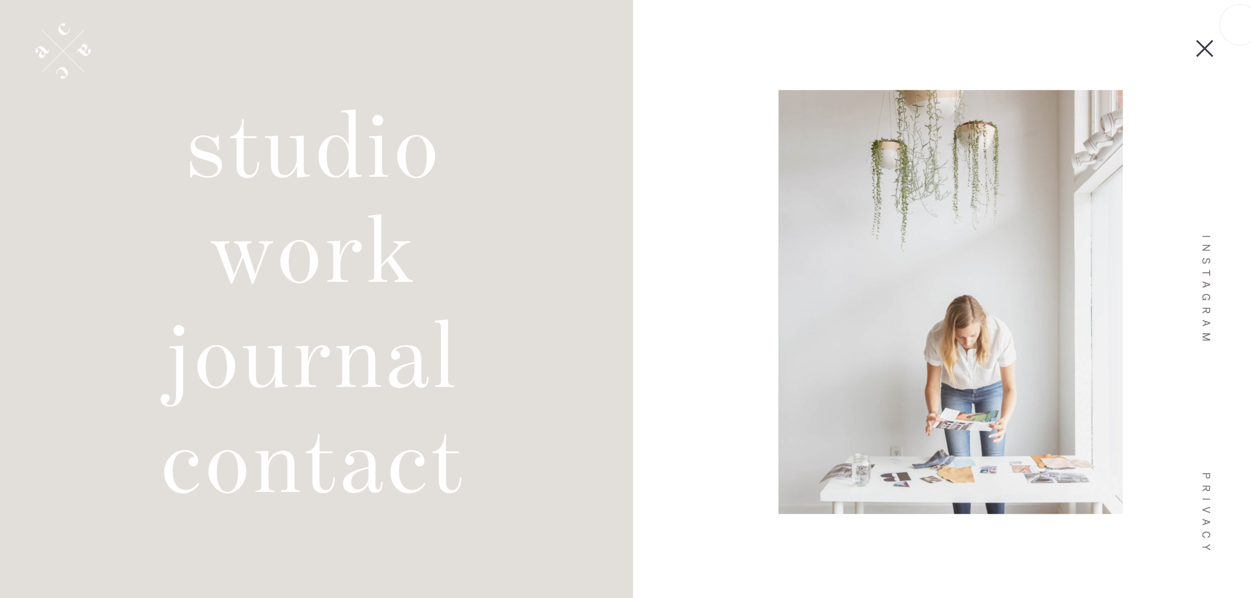
5. Use minimalism and whitespace to your advantage
Whitespace is trending in 2020, and we don’t see it slowing down. Keep in mind that whitespace isn’t necessarily white, but simply refers to the blank spaces that exist between blocks of content.
As users become more and more inundated with information, design is becoming increasingly minimalist. Use white space creatively to make a site that’s clean and scannable, yet still engaging. The idea is to create calm, not clutter.
6. Consider bold, eye-catching hero images
Your hero image tells the story of your brand and is your first point of contact with users.
This year, we’ve seen the rise of large, bold hero images that take up space and incorporate creative elements such as video and animation. We’ve also seen paired down hero images that use large text and interesting fonts to communicate their message directly.
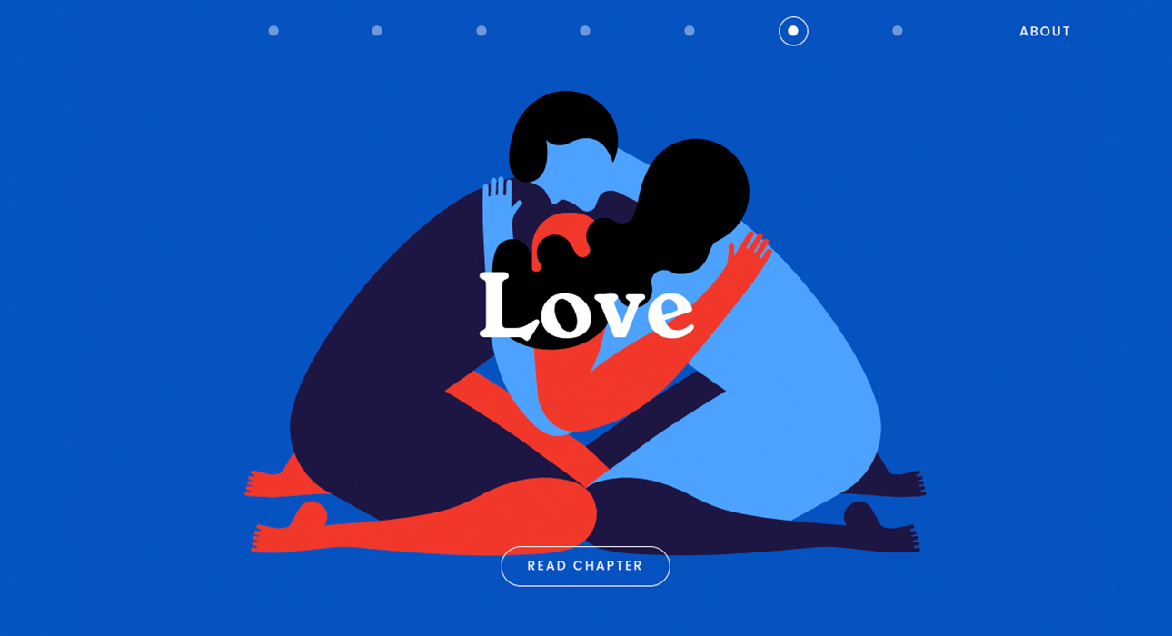
7. Use playful design elements to communicate your message
Show, don’t tell! We all know that large blocks of text are unappealing to users, but how to get around this problem when trying to explain large concepts?
Illustrations, infographics, animation, and multimedia images can go a long way in creating interest and enhancing content.
8. Consider using interactive or video elements
Users are engaging with video content in their day-to-day lives more and more (think TikTok!), so incorporating moving images into web design seems like a no-brainer. These elements are extremely effective in drawing users in and keeping them engaged on your site.
But be careful– cluttering a site with too many moving elements can overwhelm your user and degrade the speed and quality of your site. Focus on using intentional pieces that have a defined purpose. As always, less is more!
9. Ensure your design is responsive and mobile-friendly

For most websites, a large majority (sometimes over half) of site traffic comes from mobile devices. That means that your website should be responsive. Content shouldn’t disappear on a phone screen, and ease of use on mobile should be a key consideration in your design. Once again, consider your audience– what medium are they using? Desktop? Phone? Tablet? Think about the context of each user, and design a site that works in those contexts.
10. Don’t forget about speed

There’s only a brief window of time between the moment a user lands on your page and the moment they click the back button. If your site is overwhelmed with elements that slow it down significantly, your user may not even get to explore your pages at all. In fact, most users anticipate a site to load within 2 seconds. Any longer, and you may lose them forever.
Not only is slow-loading a turn-off for most users, it’s also a turn-off for Google. Speed is a significant factor for Google when ranking websites, so make sure to keep it in mind during your design process.