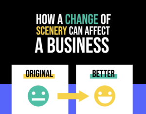


7 Common Mistakes When Designing a Webpage
In this day and age, a website is the backbone of every business. More and more businesses have started taking web design more seriously, and some of your competitors have websites that not only look great, but also have awesome features and great functionality too. There are good reasons for the effort that companies are putting into their websites, the main one being that it attracts visitors.
But just having a website is not enough. You want a webpage that performs: one that brings in quality traffic, drives qualified leads, and helps build your brand’s credibility. If your website is not built properly or well designed, then you might notice that the traffic never meets your expectations, or that the visitor count has been in decline for some time. In either case, it might be because you made some of the main mistakes web designers try so hard to avoid.
Even though these are usually subtle mistakes, they do a lot of damage. They make it difficult for customers to buy and make your visitors feel overwhelmed. In short, they push people away. Without further ado, let’s take a look at the 10 common mistakes businesses make when designing a webpage.
Cluttering Your Website
This is a mistake a lot of businesses make if they don’t have a solid foundation on what they want their webpage to be: adding excess elements just because they are available. The main thing to focus on is to portray important business information right away on your website. Visitors who can’t understand what your site is about within a few seconds of arriving on your site –which is likely to happen if it’s too cluttered– will leave.
A crowded website is never a good thing. Websites with tons of images, text, and other things going on will take a long time to load, and they’ll confuse your visitors.
A good idea is to read up on basic design principales before you start thinking about the layout of your webpage. You should start out with a clear mental picture of what you want your website to achieve and how it is going to do that. This is because today, there are so many tools and available options (pop-ups, animated logos, embedded video, etc) that amateur designers can become overwhelmed.
Not Having Analytics to Measure Performance
One of the biggest web design mistakes you should avoid is not looking at important data behind your webpage’s use. Search Engine Optimization (SEO) and analytics are the best tools to measure your website’s popularity. These tools can tell you how well your website is doing in terms of ranking and traffic. Analytics can help you find flaws in the user journey. That is how you find out what’s working and what needs improvements, which calls to action are getting clicked and what aspects need to be upgraded.
A widely used and very helpful tool is Google Analytics. If you’re not familiar with it, you might need to invest some time reading about it and learning how it works. This tool will give you a ton of valuable information about user behaviors, and you can use it to set up goals for conversion tracking.
Additionally, pairing the data you get from analytics with a digital advertising campaign will allow you to target and retarget your marketing strategy to an audience that will bring you business.
Not Being Mobile Friendly
According to statistics, more than 80% of the world population owns smartphones nowadays. This means that a lot of them use the internet via their mobiles, and if they are going to be visiting your webpage from their phones, it needs to be designed so that these users have a good experience too.
If your website is not responsive and doesn’t scale well to a smaller screens, then you are missing out on a lot of traffic. Mobile users will get frustrated and will not stick around to try and use your page if they can’t view it or read its content properly. Improving conversions should be one of the main goals when designing a website. In a world where most of the visitors are going to be using a smartphone, they need to have a good user experience. This means a website where all the information is visible, clear and organized, and where they are able to buy products straight from their phone.
Not Having a Clear Call To Action
If you are finding that your website gets lots of traffic, but you are not achieving your objectives, then it is possible that there is something wrong with your Call To Action. Your Call to Action (CTA) is the gateway to your business. It is the phrase that commands your visitors to do something, for example: “Click here to get a coupon!” or “Subscribe to get exclusive sales”. It’s very important that your CTA tells your visitors in a clear manner what they need to do and what they will get out of it, as well as what information they need to provide.
However, overdoing your CTA is also a common mistake. Keep it simple, make sure it is concise and tells customers exactly what to do, but don’t be annoying or over-explicative. Remember everything in your call to action matters, from the colors of the buttons, to where it’s placed on the website, and the acutal words you choose to use.
A Website That Takes Too Long to Load
Think about it: when you visit a website that takes too long to load, you probably get impatient and leave within a few seconds, a minute at most. In fact, anything that takes more than 3 seconds to load is already too long, and, according to a Think with Google article, it will make you lose the visitor.
If your site is taking too long to load, then you need to rethink and probably redo some design elements. People want to get information fast, and the better your site is at giving them that, the better the experience is for your visitors. First, you should consider optimizing the images on your website so that they don’t take as long to fully load. Update hefty plugins, themes, and modules to help speed things up.
If you don’t have a website yet and are only starting to think about it, make sure that having a fast load time is at the top of your list of requirements to your web designer or creative agency.
Having Images that are Poorly Designed or Irrelevant
Photos and graphics are one of the most important elements of web design. A good image can convey complex thoughts quickly without having to physically read text. However, when the images are not good, they can confuse the reader. Many businesses are still not paying attention to their images and are using low-quality and irrelevant images, which is a mistake you should avoid at all costs.
For example, if possible, don’t use stock imagery, given that most of the time they are too generic, which can be confusing. It’s always best to have original photos, but if you don’t have the resources for that, try to use images that add to your message and convey what your business is about. On the other hand, poorly scaled images (think stretched or pixelated) seem cheap and unprofessional, and, ultimately, decreases trust. Take this into account when sizing the images for your site.
Your Contact Information is Hard to Find
Even though it might sound obvious that your contact info should be easy to find, it’s strangely one of the most common mistakes businesses make when designing their webpage. The moment visitors decide to make a purchase or use your services, it is important that they have the necessary contact information to follow through with their decision.
If your contact details are not visible, or they are incorrect, then you are never going to get any good business from your website. If your visitors keep sending emails to an address that never gets read, then you are wasting both your time and theirs as well. Make sure your contact information is laid out in a strategic place on your site, and that your details are correct and up to date.
Need Some Help?
These are some of the most common mistakes small businesses make when designing their webpage. It might sound overwhelming to have to take all of this into account, but it doesn’t have to be. There are tons of resources out there that can help make this process a lot easier. For example, check out this site that has a lot of cool info on what makes a good business webpage. Additionally, if you’re based in the Washington DC area, they can guide you with all things regarding your web design needs.
Which of these do you think is the most common mistake businesses make? Please let us know in the comments below.