
Design Trend: Avant-garde Navigation Blueprints
The conventional wisdom that navigation menus must reside at the top of a website design has gradually faded into the past. Although many designers still adhere to the tried-and-true method of all-caps navigation at the top of the screen with sans serif typography, there’s an increasing shift towards more innovative approaches.
Creative navigation blueprints can bring a playful and captivating touch to a website, as long as they remain user-friendly and intuitive. Novel navigation styles can infuse a sense of excitement into small websites, those with minimal content, or those that aim to guide users along a specific path.
Although unconventional navigation may not suit every project, it can be an enjoyable option for the right undertaking.
Side Navigation: A New Angle
Side navigation offers a plethora of possibilities, ranging from static to dynamic and available in various widths.
While shifting the navigation from the top to the side might not seem groundbreaking, it can significantly impact your design by altering the canvas’s aspect ratio.
Designers must then tackle how this typically slender navigation bar will appear on different screen sizes and handle long words (avoiding a nav bar brimming with hyphens).
Much thought is required.
The optimal side navigation is uncomplicated, featuring short words and a fixed space. Excessive scrolling in navigation can be disorienting and challenging to comprehend. Sanctum’s example, shown above, is straightforward and polished. The nav remains stationary as the user scrolls, with the text transitioning from light to dark when the background changes.
This example’s vertical navigation pattern encourages users to focus on the name and logo before progressing linearly down the screen to explore available navigation options. It’s an elegant and practical design.
Hidden and Pop-Out: A Surprise Element
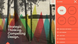
The widespread use of hamburger and other concealed icon-style navigation has given rise to pop-out menus.
Click or tap the button, and the navigation emerges, covering part or all of the screen (often depending on screen size).
While not entirely groundbreaking in itself, the variety of designer interpretations is what makes it experimental. Although users are becoming more familiar with hamburger icons, these patterns remain relatively unknown. The diverse icon types used by designers add an element of challenge.
Nonetheless, the pop-out style from Caava Design, shown above, is intriguing. While most designers opt for flat, straightforward pop-out variations, this one possesses greater depth. The design helps users locate the most critical navigation aspects and guides them through the layout.
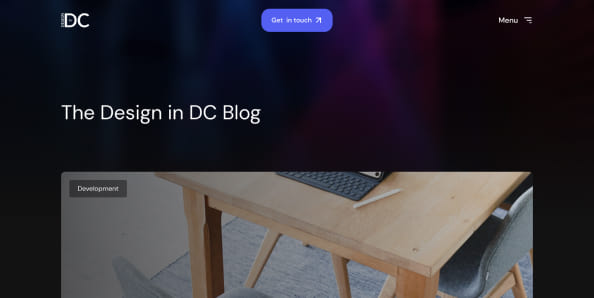
Horizontal Scroll: Defying Gravity
Encountering a horizontally scrolling site for the first time can be somewhat peculiar. A particular design is required for this flow to feel natural due to the unusual difference in physical and visual movement.
To maximize horizontal scrolling navigation, designers should incorporate visual cues to make the concept more comfortable for users. Arrows or other directional tools can be beneficial.
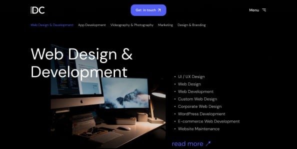
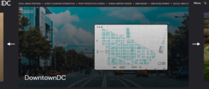
DesigninDC, shown above, employs a partial image as a visual cue, indicating additional content on the side of the screen with a fixed top-to-bottom view. The content is arranged in such a manner that the horizontal movement appears more natural due to the provided visual cues.
No Navigation: Bold Minimalism
Some websites are boldly discarding navigation altogether, choosing an all-encompassing, on-screen style. This daring pattern raises questions about whether users will know what to click and which actions to take.
The “no navigation” blueprint works best for compact sites directing users to perform a single action. It can be effective for a “coming soon” page or a thank-you/recap-style website. With only a few clickable items and a short scroll, it’s easy to navigate.
The subtle animation in the design also assists (arguably functioning as navigation since it encourages user movement). However, this pattern can undoubtedly be tricky to master.
Page with Markers: Navigating with Clues
Many experimental navigation patterns are implemented on single-page websites – and for good reason: users are less likely to get lost in a one-page format.
To provide direction and help users feel they are making progress in the design, many single-page navigation patterns rely on markers. Similar to the traditional slider format that uses a dot or bar to indicate progress, this navigation style employs the same concept.
A great example is pages that excel at this approach by placing markers on the right side of the page, including hover text that informs users of each dot’s purpose (a feature often missing in this style of navigation).
The key to this design style is ensuring a snappy experience. Smooth scrolling effects and an easily digestible design, as demonstrated in this example, help guide users through the content.
Subtle Edge Nav: Turning the Corner

Some designers are rotating navigation 90 degrees and anchoring it to the right edge of the page. This subtle technique is primarily used for small or portfolio-style websites and is becoming increasingly popular.
Navigation elements in this style tend to be text-only, include just a few items, and are generally small. The rotated navigational text can point into or out of the design, depending on other elements on the screen.
Similar to vertical navigation, this concept can alter the overall aspect ratio of the design since a sliver is removed from the side for navigation. The challenge with this style is that navigational elements are subtle and small, making them easy to overlook.
Conclusion: Embracing the Unconventional
Do you lean towards traditionalism when it comes to navigation, or are you open to exploring something more avant-garde? Experimental navigation patterns are a trend that appears to be gathering momentum.
As more designers experiment with these techniques, users become accustomed to the changes and adapt accordingly. However, there’s always the lingering concern that some users may struggle to understand and adapt to new ways of navigating a website. As designers, we cannot be afraid to push the boundaries and usher in a new era of design.
Don’t forget to follow us on Social media if you want to stay up to date with all of the latest Design In DC news!