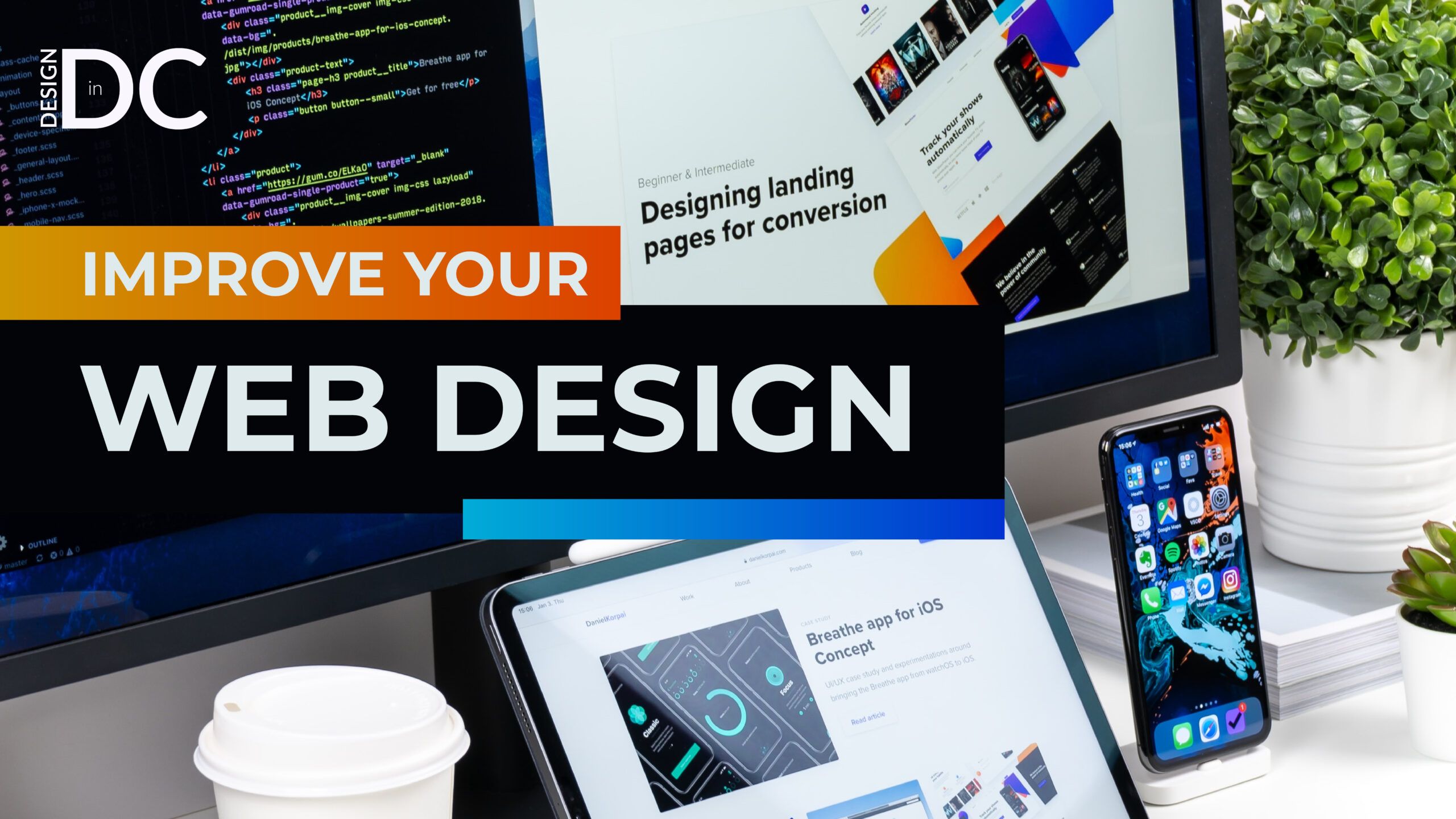
How Can You Improve Your Website’s Design?
Enhancing a digital platform doesn’t always require a complete overhaul of a website’s programming – in fact, there are several ways to improve a website’s design without having to make dramatic changes to its code. In this post, we will outline 8 easy-to-implement strategies that will optimize your website through design alone.
Why Should I Improve My Website’s Design?
Before we dig into these strategies, it’s important to understand why design updates are so critical in the first place.
For most businesses and organizations, websites operate as a primary digital marketing tool. They are often the first touchpoint for a consumer or client with a company’s brand – they serve as a place where businesses can highlight their products and services, and where consumers learn more about an organization’s vision and values.
Which is why it’s so important to optimize a website’s design. A well-designed website can not only help businesses attract new customers but can also convert leads into sales; conversely, a poorly-designed website will result in a loss of leads and potentially revenue.
The differences between a successful website and an unsuccessful one are often not as technical as many people might think. Small oversights in design can create a big (and negative) impact on UX. If you’re worried that your website isn’t performing as well as you’d like, try implementing the following design improvements.
1. Streamline Your Website’s Homepage
Much has been written these days about our limited attention spans. Research coming out of Microsoft shows that our attention spans have declined from 12 seconds to 8 seconds within the past decade. Keeping this number in mind, it’s essential that your website’s homepage clearly illustrates your organization’s value proposition quickly and efficiently. Things like slow-loading animations, complicated effects, and dense content are only going to eat away at that precious time. Instead, try to clear away any extraneous material so that your user understands what it is your organization does without any distractions.
2. Stick to a Style-Guide
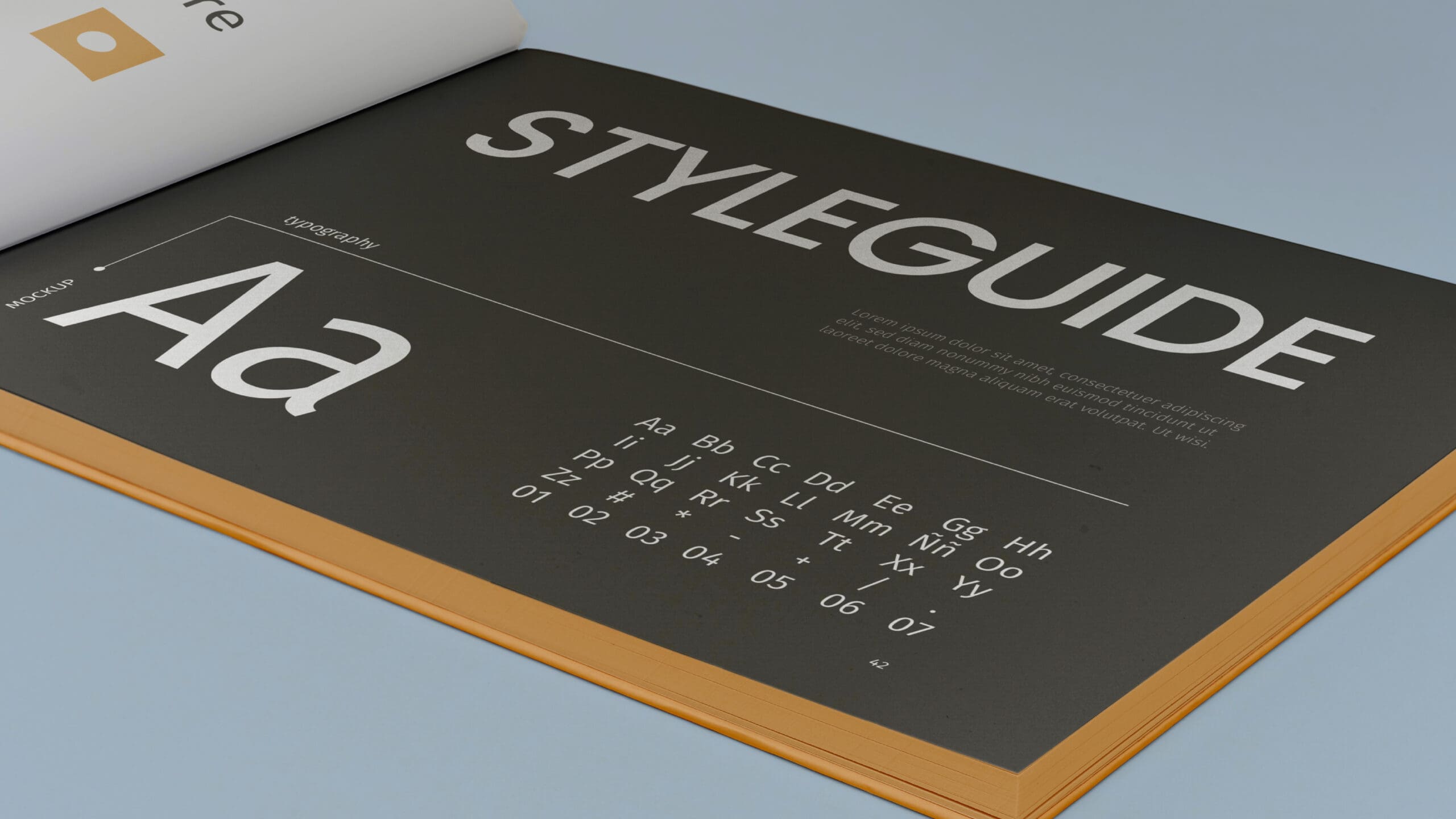
When possible, it’s best to stick to a uniform style, preferably predetermined through a style guide. This style guide should dictate what color, fonts, imagery, iconography, and logo design are to be used throughout the site. A website that switches between different styles can be off-putting to users for several reasons. For starters, the interplay between different aesthetics can be overwhelming to some users; not knowing which elements to focus on, the user may choose to navigate away to a site that’s more aesthetically cohesive. Mixing styles also lowers a site’s credibility – it gives users the impression that pages and sections were added ad-hoc and without an overall vision or objective.
3. Include Calls-To-Action
Calls-To-Action or CTAs are an absolutely critical component of any successful website. They are what guide the user through the site, thus increasing interactivity and ensuring the site’s objectives are met. Optimally, CTAs are what create an intuitive user experience, coaxing users from page-to-page depending on their incoming needs. Without CTAs, a user must rely solely on the top navigation, which bluntly interrupts their user journey.
But in order for CTAs to be successful, they must also be strategically positioned. We suggest placing the CTAs as buttons below sections that require action and at the bottom of each page. These buttons should be easy to identify – try to limit the text on each CTA and use active, verb-based language (ex. “Discover more” rather than “Click here to find out more”).
4. Use High-Quality, Modern Images
Nothing ages a website more than outdated images. It won’t matter how fresh your written content or dynamic your layout is, if you include a photo that looks like it’s from the early aughts, your users are going to start dropping like flies. The reason? We are primarily visual creatures and the images you use are the biggest cues users take into account when considering (often subconsciously) how up-to-date your website is.
For that reason, it’s a good idea to replace your images every couple of years. We always recommend custom photography, but if that’s not an option be sure to stay away from unrealistic or low-quality stock images. A pixelated photo of a team mechanically smiling as they perform their work isn’t going to do your website any favors.
5. Make Use of White Space
A common design mistake that’s made is filling in a page with too many elements. It might sound counterintuitive, but including more white space, also known as “negative space”, will dramatically increase readability. White space enables users to understand where each section begins and ends, and helps focus users’ attention on important information. White space also balances the page, making it more visually appealing. Think about Apple – they often showcase their products on an otherwise “empty page”. This naturally draws the reader’s eye to the product. And increasing whitespace is an excellent way to highlight CTAs; it has been proven that surrounding a button with whitespace is as effective as doubling that button’s size.
6. Homepage as a Site Summary

A website’s homepage has many functions. It’s the user’s first impression of both the website’s functionality and the company’s brand. But a homepage’s most important function is to guide users around the site. At Design in DC, we like to think of the homepage as the site’s directory – users should be able to find the specific page they’re looking for from it. To accomplish this, we suggest summarizing each main page of the site onto the homepage. That way, as users scroll through the homepage, they can break off when they reach the section that’s most relevant to their needs. By providing multiple entry points to the site’s subpages, users are more likely to stay engaged and navigate deeper into a site.
7. Highlight Contact Information
This one sounds like a no-brainer, but you’d be surprised how many sites require you to dig through them to find contact information. Instead, be sure to incorporate contact info in a couple different areas on the website. We suggest adding a contact button somewhere in the main navigation and also at the footer of each page.
8. Ensure Your Website is Mobile Responsive
This is perhaps the most technical but also the most important design tip. 80% of internet users own a smartphone and are as likely to search your website on their phone as their desktop. Therefore a site that has a poor mobile interface is as detrimental as a poorly designed website.
When designing your mobile website, you need to take a slightly different user experience into account. Ask yourself, why would a user access my site on mobile? What things would they look for? Does the mobile experience currently allow them to do those things? Responding to these questions through design will increase UX and lead to more conversions. Win win.
In Conclusion
Hopefully this post has illustrated the importance of web design and provided simple solutions for how to improve it. In our fast-paced world, websites don’t have a particularly long shelf-life. But optimizing a website doesn’t always entail a complete redesign – if you haven’t already, implementing the tips we’ve outlined will immediately improve a website’s design.
In summary, here are the 8 ways to improve your website’s design:
1. Streamline Your Website’s Homepage
2. Stick to a Style-Guide
3. Include Calls-To-Action
4. Use High-Quality, Modern Images
5. Make Use of White Space
6. Homepage as a Site Summary
7. Highlight Contact Information
8. Ensure Your Website is Mobile Responsive
While some of these strategies can be implemented through a site’s CMS, others are a little more tricky to do without the help of a seasoned designer. If you’re interested in improving your site, book in a consultation with one of our experience designers here today https://designindc.com/contact/