
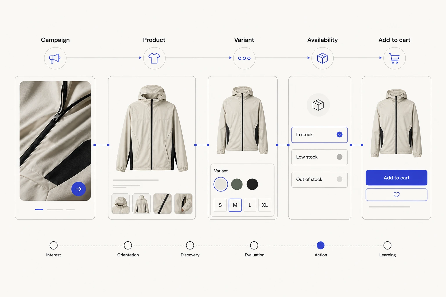
A shopper can move through six distinct states between first interest and a useful product action: interest, orientation, discovery, evaluation, action, and learning. Retail sites lose revenue opportunity when those states get treated as one generic browse session.
That is the working frame for ecommerce brand web design. A campaign, creator endorsement, search result, editorial story, or direct visit may earn attention, but the website has to carry the thread into a product route someone can understand. The goal is continuity: the visitor should recognize why a product matters, which version fits, what proof supports the choice, and what action comes next.
What makes a consumer brand website product-led?
Product-led ecommerce brand web design uses brand expression to help someone interpret, find, and choose an offering. Story and imagery provide context. Product routes convert that context into a useful next step.
Three common failure states break the connection. Campaign theater gives visitors a striking idea with no relevant product route. A bare catalog removes the reason one product or brand deserves attention. A polished generic journey sends every person to the same collection, regardless of the promise, problem, or product that brought them in.
The remedy begins with the visitor’s current interest state:
- Inspiration: “Show me what this looks like in a life or setting I recognize.”
- Problem awareness: “Help me understand which type of product addresses my need.”
- Category exploration: “Give me a useful way to narrow the field.”
- Product comparison: “Explain the differences that affect my choice.”
- Purchase readiness: “Let me select the right option and act with confidence.”
Forcing every state toward an immediate purchase can create a mismatch. An inspired visitor may need a curated edit. Someone comparing products may need fit, material, availability, or return information. A ready shopper may want a variant selector, store locator, subscription choice, or purchase control without another campaign film in the way.
This article follows that complete brand-to-action journey. It won’t duplicate a catalog of ecommerce website features that improve conversions. Feature selection matters only when it supports a specific interest state and action.
Can shoppers follow the interest your brand creates? Get a Free Website Assessment. We can shape a clearer journey from campaign promise to informed product action.
How do you connect brand storytelling to product discovery?
Start with a content-to-product map. For every major campaign, story, creator collaboration, buying guide, and editorial theme, record the audience need, relevant collection, specific products, and sensible next action. This simple exercise exposes pages that generate attention without giving it direction.
The destination should preserve recognizable cues from the source. If an ad promises lightweight equipment for city commuters, the landing experience should carry that use case, vocabulary, and visual setting into an appropriate collection or product group. Dropping the visitor on a general shop page makes them reconstruct the connection.
Product exposure can take several forms: descriptive links, product cards, curated edits, shoppable media, use-case routes, or explained recommendations. Choose the form that helps the visitor predict what follows. A mysterious image hotspot may provide weaker direction than a clear link labeled “Shop lightweight commuter bags.”
Map likely actions to the visitor’s interest:
- Inspired by a campaign: Explore the featured edit or the products shown.
- Interested in a use case: Compare a small set selected for that situation.
- Exploring a category: Narrow by meaningful attributes and open a relevant product.
- Returning to a known item: Reach the product or saved state directly.
- Ready to buy locally: Check availability or use the store locator.
Discovery needs durable routes. Google’s guidance on ecommerce website navigation structure explains that its crawler generally follows links among menus, categories, subcategories, and products. Products reachable only through an internal search box may be harder for Googlebot to find. The same hierarchy can help people, although Google’s documentation doesn’t prove that one menu pattern will increase sales.
Keep standard anchor links available when carousels, interactive stories, or campaign effects carry product content. Test those routes on mobile, with a keyboard, and without assuming the visitor knows the catalog vocabulary. Search can support discovery, but it shouldn’t rescue an otherwise invisible product path.
Detailed category architecture belongs in DDC’s guide to ecommerce category pages for SEO and conversions. Here, the category serves a larger purpose: it keeps the campaign promise recognizable while helping someone move toward a suitable product.
What must shoppers understand before they can choose a product?
Interest changes character once a visitor reaches evaluation. The question shifts from “Does this feel relevant?” to “Will this product work for me, in the version I can actually receive?”
A useful evaluation path answers decision questions in the order they arise:
- Product identity: What is this item, and which promise or use case does it fulfill?
- Use and fit: Who or what is it designed for, and what constraints matter?
- Variant: How do size, color, material, capacity, model, or configuration differ?
- Price and availability: What does the selected option cost, and can the shopper obtain it?
- Delivery and policy: When might it arrive, and what return or exchange conditions apply?
- Proof: Which claims, reviews, demonstrations, or endorsements help evaluate it?
- Action: Can the visitor choose, save, locate, subscribe, add, or buy without losing state?
Information proximity matters. Put concise size, variant, stock, price, and policy cues near the choice they affect. Deeper guidance can sit in a drawer, guide, or linked policy, provided the visitor can open it without losing the selected product state.
Baymard Institute’s product-page UX research identifies recurring needs around clear size selection, images that communicate scale, saving, unit pricing where relevant, total-order-cost context, return-policy access, and review content. Those examples aren’t a universal product-page formula. They show the range of practical uncertainty that can remain after branding has done its job.
Specificity should win at commitment points. A playful color name can support the brand voice, but a shopper may still need a conventional color description. Lifestyle photography can create desire, while a scale reference or dimension helps someone judge use. Teams seeking photography depth can use DDC’s article on custom photography for ecommerce sites rather than forcing one image style to carry the whole decision.
Keep the chosen state visible as the visitor moves through information. If opening a size guide resets the color, if changing a variant hides availability, or if a policy link abandons the product, the website has broken continuity at the moment of evaluation.
How should reviews, creators, and brand proof support action?
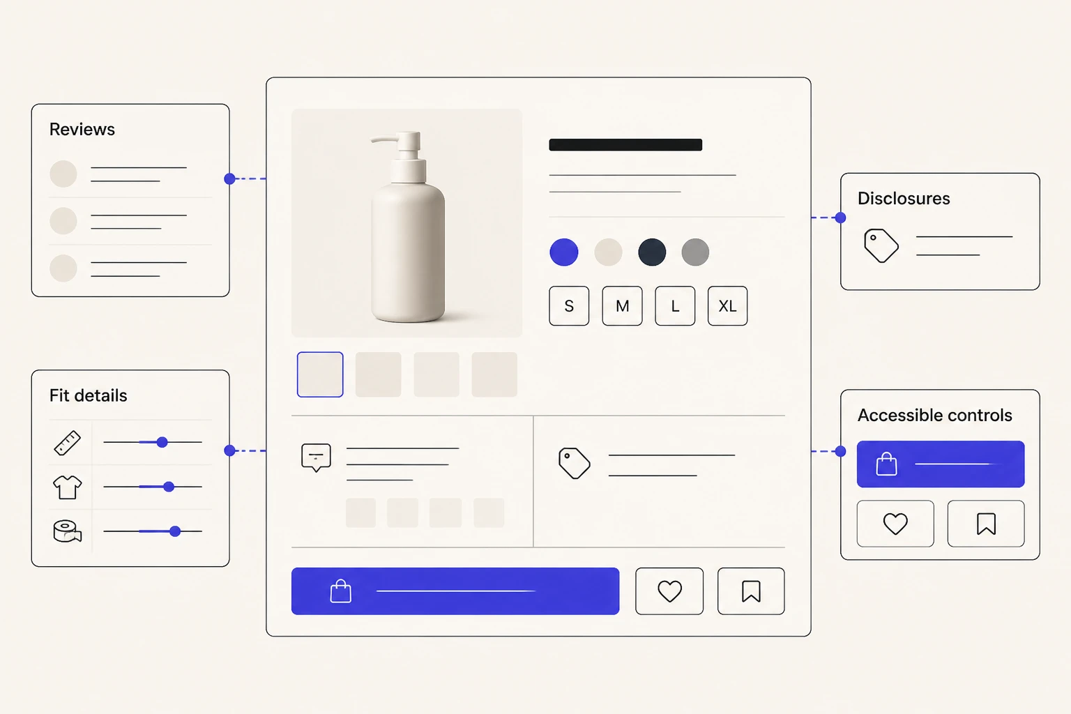
Proof works when its source and purpose are legible. An owned product claim, customer review, creator endorsement, expert assessment, certification, and community image answer different questions. Mixing them into one undifferentiated social-proof wall makes each harder to interpret.
Start with the decision. A review may help with fit or long-term use. A creator demonstration may show the product in a recognizable context. A certification may address a defined standard within a stated scope. Community content can reveal styling, scale, or variation across real settings. The page should identify who produced the material and what it can reasonably support.
Commercial relationships need careful treatment. The U.S. Federal Trade Commission’s endorsement guidance states that endorsements must be honest and not misleading. When an audience wouldn’t reasonably expect a material connection between an endorser and marketer, that connection may require clear and conspicuous disclosure.
Context must survive reuse. If a paid creator video moves from social media into a campaign page, product gallery, clipped testimonial, or shoppable module, don’t detach the endorsement from information needed to understand the relationship. A platform disclosure tool alone may not be sufficient in every context, according to the FTC.
Label brand-authored claims and customer-authored content clearly. Preserve dates when recency affects meaning. Give review responses an identifiable brand voice, and avoid editing customer language in ways that change its substance. Relevance and attribution are what turn proof into persuasion: they give shoppers better material for the decision already in front of them.
Specific campaigns and markets require qualified legal review. This journey framework doesn’t supply universal disclosure language or a compliance safe harbor.
How does accessibility protect the path from discovery to action?
Accessibility keeps the product journey available across different ways of perceiving, navigating, understanding, and operating a site. The W3C Web Accessibility Initiative organizes WCAG 2 around four principles: perceivable, operable, understandable, and robust.
Applied to commerce, those principles follow the same thread as the brand journey:
- Perceivable: Product identity, imagery, captions, price, availability, and status don’t depend on one sensory cue.
- Operable: Navigation, search, filters, carousels, variant selectors, forms, and action controls work through supported input methods.
- Understandable: Labels, choices, validation, errors, and feedback help people predict and recover.
- Robust: Product structure and interaction states can be interpreted reliably by relevant browsers and assistive technologies.
State deserves special attention. A shopper who selects a medium blue item should receive the same identity, price, availability, and action feedback whether they use touch, a mouse, a keyboard, zoom, or a screen reader. Color alone shouldn’t communicate a stock change. Focus shouldn’t disappear after a variant update. An error should identify both the problem and a workable correction.
Test the complete route rather than isolated screens. Include keyboard navigation, screen-reader review, zoom and reflow, mobile use, and usability sessions. Automated checks can find certain defects, but they can’t establish that a shopper understands the product or can complete every journey.
WCAG reference and design review don’t certify conformance by themselves. Formal accessibility assessment, remediation, and applicable legal review require qualified specialists and a scope tied to the actual implementation.
Could every shopper operate the route from story to product choice? Get a Free Website Assessment. We can connect brand expression with accessible discovery, evaluation, and action.
How can search and product data extend the journey beyond the site?
A shopper may encounter product identity, price, availability, and imagery in Google before seeing the homepage or a campaign. Off-site discovery creates another continuity challenge: the information presented before the click should align with the landing destination and the actual purchasable option.
Google documents Product structured data and Merchant Center feeds as complementary ways to share commerce data. On-page markup can help Google understand a product page and make it eligible for product-rich experiences. Merchant Center can provide deeper commerce data and specify products a merchant wants to show.
Eligibility is the careful word. Structured data or a feed doesn’t guarantee visibility, ranking, traffic, or sales.
Operational alignment matters across these fields:
- Product title and stable identifier
- Primary image and relevant variant imagery
- Variant, size, color, or configuration
- Current price and applicable unit price
- Availability and product status
- Landing URL and canonical product identity
A campaign may describe a product by a new seasonal name while the feed uses an older title and the destination defaults to an unavailable variant. Each surface can be technically valid while the combined journey feels unreliable. Brand, merchandising, ecommerce, and product-data owners need a shared record of what the shopper should encounter.
Use a brand-to-action audit to find those breaks:
- Inventory the highest-priority campaign, creator, search, editorial, and direct entry points.
- Record the interest state and promise at each entry.
- Identify the intended collection, product, variant, save, store, subscription, or purchase action.
- Test whether the route is visible, descriptive, crawlable, and accessible.
- Compare the source language and imagery with the destination.
- List product questions that remain unresolved at evaluation.
- Verify price, availability, policy, review, endorsement, and feed claims with accountable owners.
- Test the full route on mobile, keyboard, screen reader, and common browser states.
- Assign owners for brand content, merchandising, product data, legal review, accessibility, and analytics.
Sort findings into three bands. Broken action paths come first, including dead destinations, unreachable products, unusable controls, or state loss. Material decision gaps come next, such as missing variant, price, availability, policy, or disclosure context. Optimization opportunities cover refinements to language, sequencing, recommendations, and creative continuity once the journey works.
This audit stays focused on the thread between attention and product action. Platform selection, a full technical SEO review, checkout mechanics, and pre-build requirements deserve their own specialist work.
What should an ecommerce brand measure after launch?
Measure progression, not traffic alone. A compact model can follow qualified entry, discovery action, product view, decision interaction, selected action, and completed outcome.
Decision interactions will vary by category. They may include a variant selection, size-guide use, review engagement, return-policy access, save action, store-locator search, or availability check. Define events around the real interface and business question rather than adopting a universal tracking template.
Segment carefully when the data volume allows. Entry path, campaign, device, new or returning visitor, and major product family may reveal where continuity breaks. A campaign can earn qualified attention while its destination loses people before product discovery. Another route may reach product pages but leave a recurring variant question unanswered.
Analytics shows behavior, not motivation. Pair event data with usability sessions, customer-service themes, site-search terms, merchandising feedback, and short research interviews. Attribution will remain imperfect across channels, devices, consent choices, and return visits. The goal is a better diagnosis of the journey, not a fictional claim of certainty.
Assign an owner to each signal and a threshold for investigation. A dashboard without a review cadence simply records the gap.
How do you preserve the thread from promise to product?
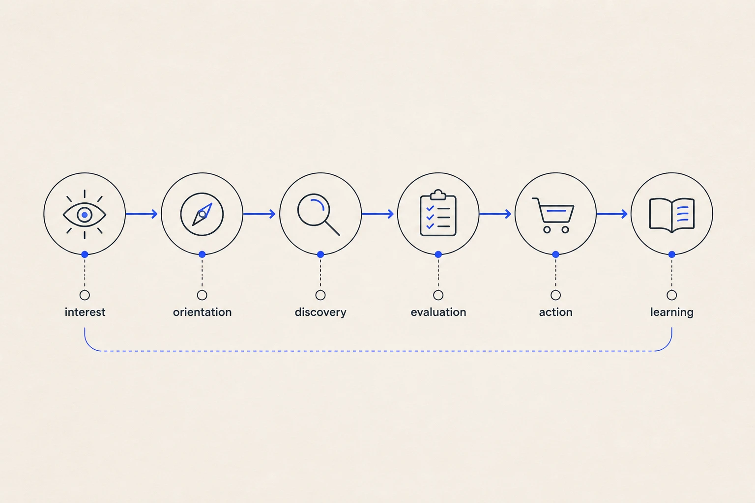
The commercial value of brand expression depends on continuity. Interest needs orientation. Orientation needs a visible discovery route. Discovery needs enough decision information and credible proof. Action needs accessible controls and preserved state. Learning needs evidence from analytics and people.
That sequence gives ecommerce brand web design a sharper standard than visual distinction alone. For every campaign, story, creator asset, search presentation, and editorial feature, ask what interest it creates and which product action can honor that interest. Then test the route as one connected experience.
Some visitors will buy. Others will save, compare, subscribe, find a store, or leave with a clearer understanding. The appropriate action varies, but the route should never make them abandon the meaning that brought them there.
Ready to turn product interest into a coherent shopping journey? Get a Free Website Assessment. We can align storytelling, product discovery, decision support, and accessible action around your customers.