

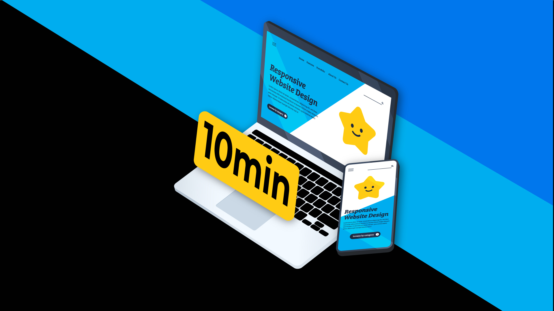
Learn how to optimize your website for mobile users in less than 10 minutes
Were you aware that the majority of internet traffic is now being viewed on a mobile device instead of the traditional desktop avenue? The chances that are you viewing this on a mobile device are pretty high. if you are to find that the quality of the site content is hard to read or disproportionally structured then there is no doubt you will look elsewhere for the information you want. With more and more people viewing internet material thru some sort of mobile device if your website is not optimized for mobile you run a high risk of losing many users.
The term mobile optimized simply means that on smaller screens your website looks amazing. It’s easy for the user to view, read and has a fast load time. If your site can look and perform well on a mobile device then it should look even better on a full desktop screen.
In this article, we are going to talk about the concept of what mobile optimization means and why it’s so essential in today’s digital world. Then, we’ll show a step-by-step list of how to optimize your site in order to make it smartphone and tablet friendly. Let’s get started!
Why Mobile Optimization Is Critical for Today’s World
It is estimated that 96% of Americans aged 18-29 own a smartphone. For many using a smartphone compared to a traditional PC, it is the only way they interact with the internet. The research also shows that more than half the searches on Google.com come from a mobile reach. The research also reveals that visitors are 5 times more likely to leave your site if it isn’t mobile-friendly. In summary, what the research is telling us is that if your website isn’t mobile optimized you could potentially be losing out on a significant number of web traffic and users.
6 Ways to Optimize your Website for a Better Mobile Experience
Now that we understand why it’s essential to optimize your website for mobile, let’s get practical. The section below will talk through crucial aspects of creating a website with mobile users in mind.
For the best results for optimizing your site for mobile use, implement the following suggestions. Let’s get started!
- Use Google’s Mobile-Friendly Tool to Test Your Site
The first thing every website owner should do is a test and evaluate against their own site. The easiest way to do this is by accessing the site through your own tablet or smartphone. This process will allow you to get a feel of how your site works on a smaller screen. The key things to pay attention to are loading time, text readability, content structure, and user navigation experience.
After you complete that self-test, use Google’s free dedicated testing tool called the Mobile-Friendly Test tool. The purpose of the Mobile-Friendly tool is to check websites and shows results if it is up to standards for mobile pages. Review the results and make changes where recommended by Google. These small actions will help your users for a better mobile experience.
- Select Themes and Plugins that are responsive
Themes and plugins are essential to any website. The themes and plugins you select for your site will be a major factor in its mobile experience. Fortunately, the majority of popular themes nowadays are built to be mobile-friendly. Simply choosing the right theme can save you a lot of headaches and time. This will help you bypass creating CSS grids manually and configuring media breakpoints.
Before buying or installing any themes it is recommended to demo them prior. Many available themes allow users to preview how the design layout looks and its responsiveness on a smaller screen. Another option to consider is using a staging website to preview themes.
- Ensure the core web vitals of your website are intact
The score of your site’s core web vitals will directly impact its SEO ranking. Core web vitals are now a part of Google’s search algorithm. The purpose of these “vitals” are to use them as metrics and give insight into the overall user experience. The three core vitals are:
- Cumulative Layout Shift (CLS). CLS will indicate the frequency of movement and shift of a page as it loads. The closer the score to zero will minimize that movement.
- Largest Contentful Paint (LCP). LCP measures the length of time it takes for the largest element on a page to load. The lower CLP score means that overall the page loads quickly.
- First Input Delay (FID). FID is a metric that measures interactivity. This score will dictate the length of time when a user can engage with a page as it loads.
- Optimize your sites loading speed
A critical part of any user’s web experience is the page’s loading speed. Optimizing the speed of your site will surely keep the bounce rate down. In today’s world, there are so many sources of information on the internet. Website owners can’t afford to lose viewers due to a slow loading experience. Below are a few impactful optimization methods that can improve the speed of your website:
- Keep your site up to date. It is important to run and update to the latest plugins, themes, and CMS for your website. Not only with this help maximize efficiency but lowers your security risk from bugs, viruses, and hackers.
- Ensure coding is minified. A major way to shave seconds off your load time is to optimize your site’s CSS, HTML, and Javascript code.
- Keep images compressed. Large images dramatically slow the download speed for sites. The best solution is to compress your images without altering their quality. There are free solutions available to assist you to achieve this such as TinyPNG tool and ShortPixel plugin.
- Install Caching. Caching will allow your site to save files in a more convenient location (visitors’ local device). So files won’t be needed to be downloaded every time the page is accessed. Many caching plugins are available to download for free.
- Select a dependable Web Host Provider
As a web owner, one of the most important decisions you will make is which web host provider to select. A common mistake is that too many web owners believe all hosting platforms are the same. Then they end up choosing the cheapest option available. The truth is picking the correct web host provider will either make or break your site. You want to select a hosting service that will maximize your site’s performance while also ensuring minimal downtime. In most cases, the best hosting plan would be a Virtual Private Server (VPS). VPS are affordable and offer great performance. For those that need more advanced features look into a host that offers a managed dedicated server.
- Create a mobile application for your website
Creating a dedicated mobile app will guarantee a mobile-optimized experience for mobile users. Through an app, you will be able to offer subscriptions, enable push notifications and directly interact with users through this interface. For app creation, we would recommend hiring a developer. Although you could code it out yourself hiring a developer will save you a lot of time and headache. Please do your research as you prospect for a development partner for a project like this.
Mobile Optimization is Essential
Hopefully, this post has illustrated the importance of website mobilization and provided a few simple solutions on how to make a website more mobile friendly.
In summary here are 8 ways to optimize your website for mobile users:
- Use Google’s Mobile-Friendly Tool to Test your Site
- Improve the responsiveness of your site using custom CSS
- Select These and Plugins that are responsive
- Ensure the core web vitals of your website are intact
- Optimize your sites loading speed
- Recreate your pop-ups for mobile devices
- Select a dependable Web Host Provider
- Create a mobile application for your website
If all of this sounds like something you would like to try, contact our full-service digital agency today! Not only does Design in DC offer all these optimization services but we can also assist with building a great website for you. Make sure to check out our blog post and contact us if you have any questions.
Where do you think mobile optimization adds the most value to your business? Please let us know in the comments below.
Don’t forget to follow us on Social media if you want to stay up to date with all of the latest Design In DC news!