
Web Design 101
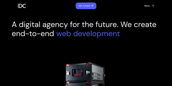
In the digital age, the significance of web design cannot be overstressed. As the virtual face of every business, a website is paramount in establishing a brand’s online presence, engaging customers, and driving business success. Today, there are over a billion websites, each vying for the attention and engagement of users worldwide. Understanding web design is not just about appreciating aesthetics; it’s about harnessing the power of user experience, accessibility, and innovation to create spaces that inform, connect, and convert.
So what exactly is web design?
Web design is the multifaceted process of creating a website, encompassing everything from the text arrangement on a page to the complex dynamics of user interface (UI) and user experience (UX). It’s a blend of technical skill and artistic endeavor that determines how a website looks, feels, and operates. A well-designed website not only conveys the brand’s message and ethos but also facilitates seamless interaction, ensuring that users can easily navigate and engage with the content.
As the digital world evolves, so does web design, constantly adapting to new trends, technologies, and user expectations. Given web design’s dynamic and ever-changing nature, anyone seeking to establish a significant online presence must understand its intricacies.
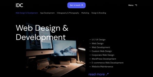
It is important to note that web design is different from web development. Web development involves creating and maintaining the structure of a website. Web developers utilize complex coding systems to ensure the desired functionality of a website.
What Do Web designers do
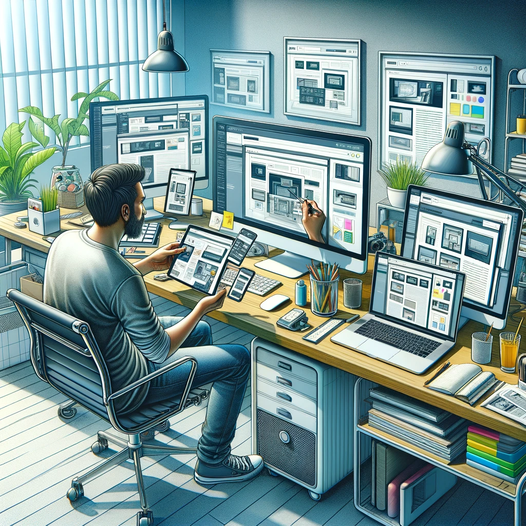
Web designers are the architects behind the digital experiences we encounter daily on the internet. Their role extends beyond mere aesthetics; they orchestrate the user’s journey through a website, balancing visual appeal with functional design. By integrating elements such as typography, color schemes, and imagery, web designers craft spaces that are not only beautiful but also intuitive and user-friendly.
In their creative process, web designers employ a variety of tools and methodologies to translate a brand’s identity into a digital format that resonates with its audience. They work closely with clients to understand their vision and objectives, ensuring that the final product aligns with the business’s goals and user expectations. This collaborative effort often involves a series of iterations and feedback loops to refine the design until it meets the desired standards of excellence
Web design agencies
When it comes to web design agencies, these entities amplify the capabilities of individual designers by bringing together a team of experts with diverse skill sets. Agencies provide a comprehensive suite of services that cover all aspects of web design and development, from initial concept to final deployment. They harness the collective expertise of designers, developers, content strategists, and SEO specialists to create cohesive and impactful websites.
Whether you are starting from scratch or searching to revamp your current website, agencies offer a one-stop solution, streamlining the process, and ensuring consistency and quality across all stages of website creation. Still not sure if an agency is right for you? Here are some signs your website needs a re-design
Elements of Great Web Design
Ok! So now that you have a better understanding of web design, it is time to learn what defines quality in web design. Recognizing the elements that contribute to great web design is essential for crafting an online presence that is both impactful and effective. Here’s a breakdown of the core elements that constitute great web design:
Visual Elements:
Visual elements are the first to capture a user’s attention, setting the tone and personality of your website. These include:
- Typography: The choice of fonts should complement the brand voice and enhance readability.
- Color Palette: Colors evoke emotions and should align with the brand’s messaging while ensuring accessibility.
- Imagery and Icons: High-quality images and intuitive icons can significantly improve user engagement and convey complex information succinctly.
- Layout and Spacing: A well-structured layout with adequate spacing enhances content digestibility and guides the user’s journey through the site.
When approaching the visual aspects of your website, it may be helpful to review these principles of design. These principles are used by designers across all industries and can elevate the visual appearance of tour work.
Functional Elements:
The functionality of a website determines its ease of use and effectiveness in meeting user needs. Key functional elements include:
- Navigation: Intuitive and consistent navigation ensures users can find what they need without frustration.
- Responsiveness: A responsive design adapts to various screen sizes, providing a consistent experience across devices.
- Loading Speed: Fast loading times are crucial for retaining user attention and reducing bounce rates.
- Interactive Elements: Thoughtful interactivity and animations can enhance engagement, but they should never detract from the user experience or accessibility.
In addition to individual elements, web design agencies play a vital role in integrating these components into a cohesive page. They leverage multidisciplinary teams to address every aspect of the design process, from conceptualization to implementation, ensuring that the website not only looks great but also performs across all metrics.
Adaptive and Responsive Web Design

As of March 2024, people using mobile devices contribute to 61.21% of all website traffic. With this information, ensuring that your website is accessible and user-friendly across all devices is paramount. This necessity has given rise to two pivotal design strategies: adaptive and responsive web design. Both approaches aim to enhance the user experience but do so in distinct ways.
Responsive Web Design:
Responsive web design (RWD) is a fluid approach that allows web pages to adjust seamlessly to the size of any device screen, whether it’s a desktop, tablet, or smartphone. The layout modifications in RWD are based on the screen size, orientation, and resolution, offering flexibility and improving the user’s browsing experience.
Key Features of Responsive Design:
- Fluid Grids: The use of proportion-based grids to arrange content and design elements.
- Flexible Images: Images that scale to fit the size of the screen without distorting the layout or user experience.
- Media Queries: CSS techniques that apply different styles based on the device’s characteristics, such as its width, height, and resolution.
Adaptive Web Design:
Adaptive web design (AWD), on the other hand, involves creating multiple versions of a website that are tailored to specific screen sizes or devices. Unlike RWD, which is dynamic and fluid, AWD selectively loads a predetermined layout that best fits the user’s device. This approach can offer a more customized user experience but requires more initial planning and development.
Key Features of Adaptive Design:
- Multiple Fixed Layouts: Designs created for several specific screen sizes, ensuring optimal layout and functionality.
- Context-Aware: Adaptive design can adjust not only to screen size but also to other factors, such as the device’s capabilities or the user’s location.
- Device-Specific Optimization: Tailoring content and features for better performance and user experience on different devices, considering factors like load times and interaction modes.
Whether you choose adaptive or responsive design will depend on your specific needs, resources, and goals, but either approach should be grounded in a deep understanding of your audience and their interaction patterns.
Accessibility for web design
Accessibility in web design means creating web content that can be utilized by people with a wide range of hearing, movement, sight, and cognitive abilities. By adhering to the principles of perceivable, operable, understandable, and robust design, you ensure that your site can be accessed by everyone, thereby extending your reach and impact.
4 Key Elements in Accessibility for Web Design:
1. Perceivability: Making Content Accessible to the Senses
- Text Alternatives: Provide alt text for images so screen readers can describe them to visually impaired users.
- Captions and Transcripts: Offer captions for videos and transcripts for audio content, aiding those with hearing impairments.
- Adjustable Layouts: Ensure content can be zoomed in or adjusted without losing information, helping users with visual impairments.
2. Operability: Ensuring User Interface Can Be Navigated and Used
- Keyboard Navigation: Design your site so it can be navigated using a keyboard alone, catering to users who cannot use a mouse.
- Sufficient Time: Provide ample time for users to read and use content, essential for those with cognitive delays or who simply need longer to interact with your site.
- Pause, Stop, Hide: For moving, blinking, or scrolling content, offer controls to pause, stop, or hide these elements to aid users who find them distracting or difficult to follow.
3. Understandability: Making Information and Operation Intuitive
- Predictable Navigation: Keep navigation consistent and predictable across your website, aiding users with cognitive impairments in learning and remembering how to navigate your content.
- Input Assistance: Offer help text, suggestions, or error messages to assist users in filling out forms and correcting mistakes.
- Readable Text: Use clear and simple language that’s easy to read and comprehend, beneficial for users with dyslexia or those who speak different languages.
4. Robustness: Ensuring Content is Interpretable by a Wide Range of Technologies
- Compatibility: Ensure your website works well with various browsers, devices, and assistive technologies, catering to users who may not have the latest technology.
- Valid Code: Use valid, standard-compliant HTML and CSS, allowing assistive technologies to accurately interpret and relay content to users.
- Testing and Updates: Regularly test your website with different technologies and users to identify issues, and keep your site updated to address these problems and adapt to new standards.
How to get started today!
Embarking on the journey of web design can be both exhilarating and daunting. At Design in DC, we’ve distilled the essence of beginning this process into actionable steps, drawing on our extensive experience and a recent blog post we made a detailed guide to give you the tools to build your website today!